Chapter 9 - Charting Data
Being able to visualize data can have a tremendous impact on the reader. Compared to just printing raw numerical data, adding a chart to a report makes it possible for readers to quickly grasp the important relationships between data. Many times reports are used with proposals to sell a reader on an idea or plan. Adding a colorful chart can sell your idea more effectively than a dry report filled with endless numbers. This chapter shows you what types of charts are available as well as how to modify their appearance so that they can make your report more appealing and quickly get your message across.
 Become a Crystal Reports expert with the authoritative resource available.
The tuturials and tips in this book will take your skills to the next level.
Become a Crystal Reports expert with the authoritative resource available.
The tuturials and tips in this book will take your skills to the next level.Buy at

This is an excerpt from the book Crystal Reports Encyclopedia.
Click to read more chapter excerpts.
Adding Charts
There are two ways to add a chart to a report: with the Report Expert and with the Add Chart Expert. If you are creating a report from scratch and you know in advance that it will use a chart, you can use the Report Expert to add the chart during the initial report creation. If you decide to add a chart later, right-click on the report and select Insert | Chart. This creates a floating rectangle that is attached to the mouse. As you move the mouse around, the rectangle moves with it. If a section doesn't allow a report to be placed there, then the cursor changes to a circle with a line through it to tell you that you can't place it there. When you move the mouse over a section that does allow charts, the cursor changes back to the standard mouse cursor. Put the cursor in the section where you want to place the chart and click the mouse button to drop it there.After placing the chart in the appropriate section, either the Chart Expert appears or a default chart is shown. If the Chart Expert doesn't appear automatically, then display it by right-clicking on the chart and select Chart Expert.
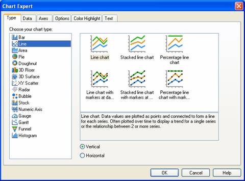
Figure 19-1. Chart Expert dialog box.
This dialog box has six tabs that are shown by default: Type, Data, Axes, Options, Color Highlight and Text. Each tab is discussed in detail in the following sections.
Selecting a Chart with the Type Tab
The Type tab selects the type of chart to display. As we discussed in the previous sections, there are over a dozen different types of charts to choose from. As you click on each chart type in the list, examples are shown in the window to the right. Each example corresponds to a slight variation that you can choose from. The variation usually relates to how the values are plotted on the chart or their relationship to each other. For example each value could be plotted along the y-axis using its value, or it could be plotted as a percentage of the whole.Charts that use an X-Y axis format have an option button that selects whether it is a vertical or horizontal chart. Vertical is chosen by default.
To read all my books online, click here for the Crystal Reports ebooks.